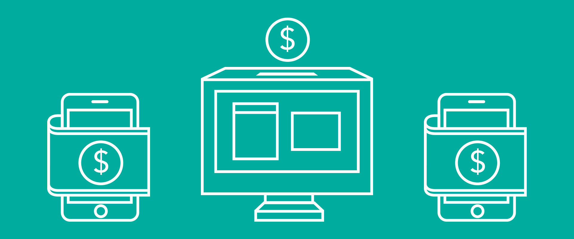
Your customers are already browsing websites on their smartphones and tablets as well as their desktop computers. You may have heard about responsive web design, but what is it and how is it different from the way websites used to be built?


With today’s seemingly unlimited devices on which to view the internet, it is clear that your content has to adapt to the customer’s device of choice, and they expect the best experience on any platform. Fortunately, “responsive design” will better serve the future of your interactive projects.
So, what is responsive design?
A responsive site is built right the first time – to be flexible enough to morph to fit any size browser on any size device. Using flexible images, paragraphs and headlines, your users see only what they need to see – and you only need to build and maintain one site.
Previously, developers would either build a separate mobile website or users would see a cropped and often inaccessible version of your website. Don’t let this happen to you. Below are some examples of how we’ve worked with a responsive approach to yield a great user experience, no matter the platform.
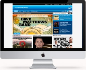
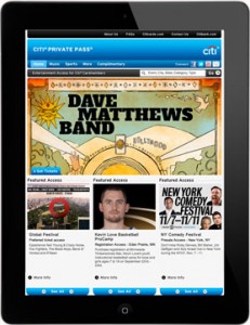
Case Study: Citi Private Pass
standard desktop version
on a smart phone

on a tablet
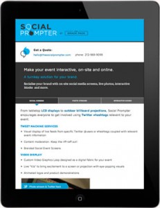
Case Study: Social Prompter
standard desktop version

on a smart phone

on a tablet
The goal when designing for smaller devices is to provide the viewer with the
information they need most, hiding elements that may slow them down or get
in the way such as large images, videos and animation. The challenge lies in creating
an experience on a small device that stays on-brand and meets the users’ needs
without the luxury of a large screen.